Design guide
Intimna strana
mediterana
Conceptual visual identity for the tourist destination Dalmatia–Šibenik
Project brief
The brief
What was asked
A new visual identity for the destination Dalmatia–Šibenik that turns the positioning “Intimna strana Mediterana” (the intimate side of the Mediterranean) into a recognisable, contemporary and functional system.
The character must be intimate, authentic, creative, romantic and human. City, coast, islands, hinterland and mountains should read as several expressions of the same character, without folkloric literalness.
The solution
One mark unites five regions, and each also has its own version of the logo.
Muted tones, details from a human point of view and fluid layers build a sense of closeness, while sound awakens memory instead of selling attractions. The same system works on the web, a poster, a business card and in space.
Intimna strana mediterana · design guide · Summary of the brief by the Šibenik-Knin County Tourist Board
02
Memory instead of advertising
Idea
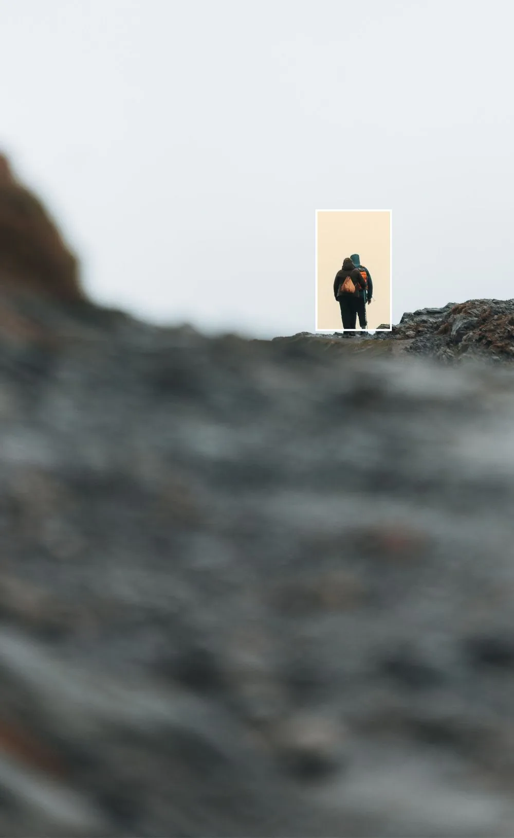
The identity does not sell attractions; it awakens memory.
The real quality of a place, its peace and the connection with people happen far from the camera lens. The concept tries to convey that feeling, unique to every person.
Intimna strana mediterana · design guide
03
What holds the system together
Principles
01
Turn towards the human
Golden ratio and details seen from a human perspective.
02
Muted tones
Pleasant natural tones that relax and give calm.
03
Fluidity and layers
Room for every guest's personal interpretation.
04
Five regions, one mark
The mark unites the regions, and each can also stand alone.
Intimna strana mediterana · design guide
04
Emotional anchors
Sound
Hearing is one of the senses that awakens emotion fastest and takes us back to the past, to a certain place or to a long-forgotten world.
Even when the years, the names of places or the faces of people fade, one original sound can return us in a second to the exact feeling we lived then.
Intimna strana mediterana · design guide
05
Versions for every region
Logo
Five regions in a layered view, through an interplay of full and empty.
Three basic versions: blue, gold and a negative on a blue background.



Intimna strana mediterana · design guide
06
One mark, five regions
Regions

Separate elements are built on the horizon line. Each region has its own mark, so the islands, coast, Šibenik, hinterland and Dinara can also stand on their own.
Intimna strana mediterana · design guide
07
Colours and textures
Palette
#0F3053
RGB 15, 48, 83
#48575C
RGB 72, 87, 92
#283E3A
RGB 40, 62, 58
#8C5518
RGB 140, 85, 24
#F9E8CE
RGB 249, 232, 206
#FEF5EB
RGB 254, 245, 235

Sun-ray
texture

Gold
texture
Intimna strana mediterana · design guide
08
Two typefaces
Typography
Aboreto · headings
Aa
Intimna strana mediterana
Manrope · text and small print
Aa
People are direct and full of character, places have kept their own rituals, and nature seems both tame and untamed.
Intimna strana mediterana · design guide
09
A human point of view
Photography
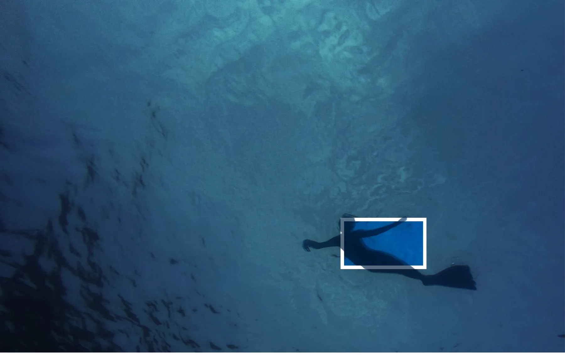
A human at the scale of nature
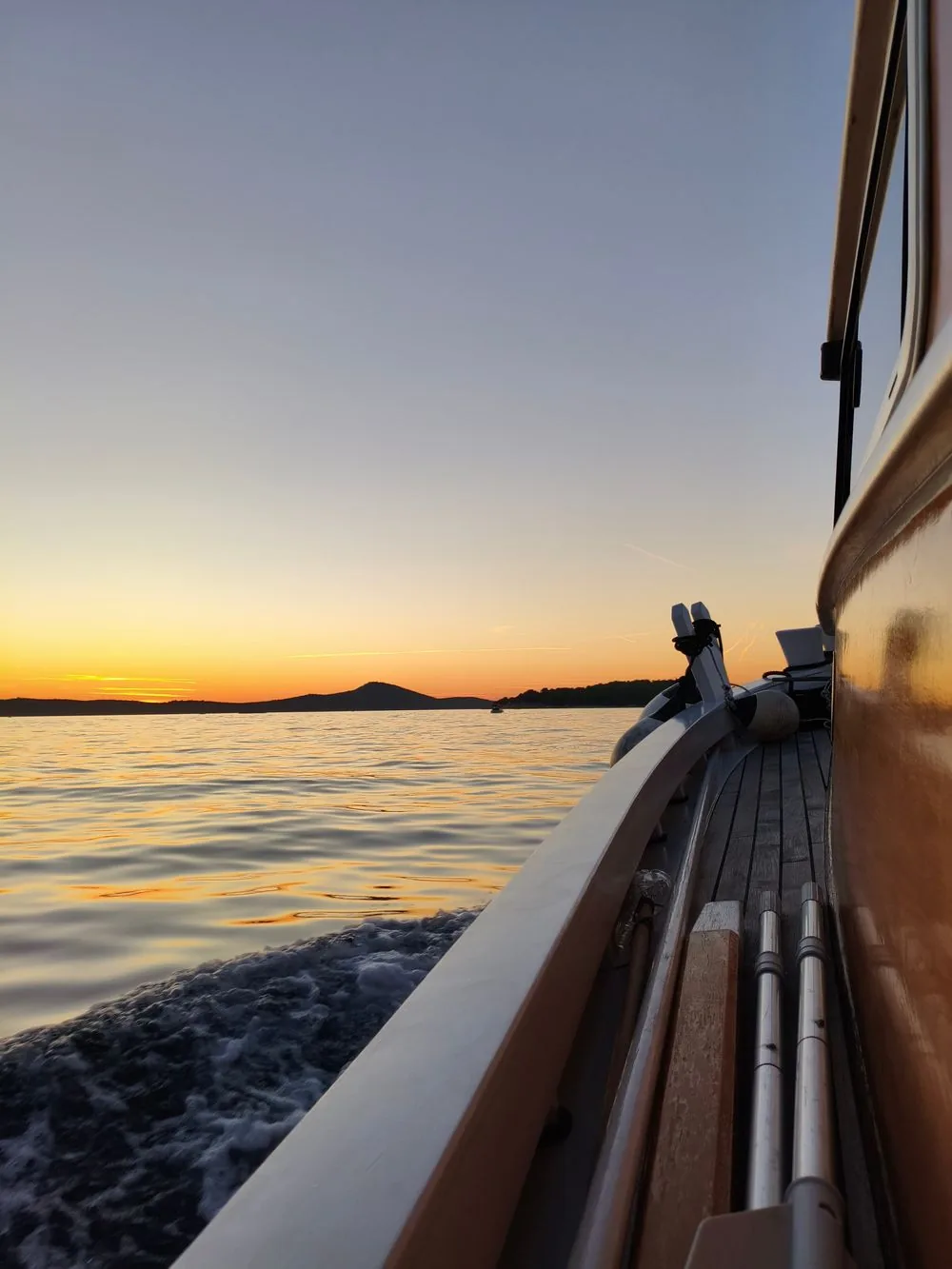
Natural beauty, sunsets, the rippling sea
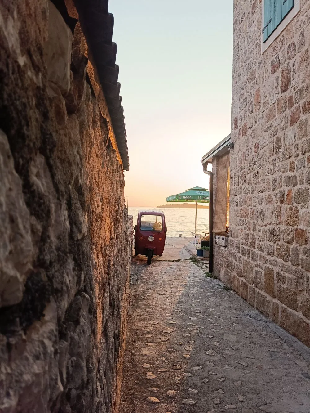
Perspectives and angles from a human point of view
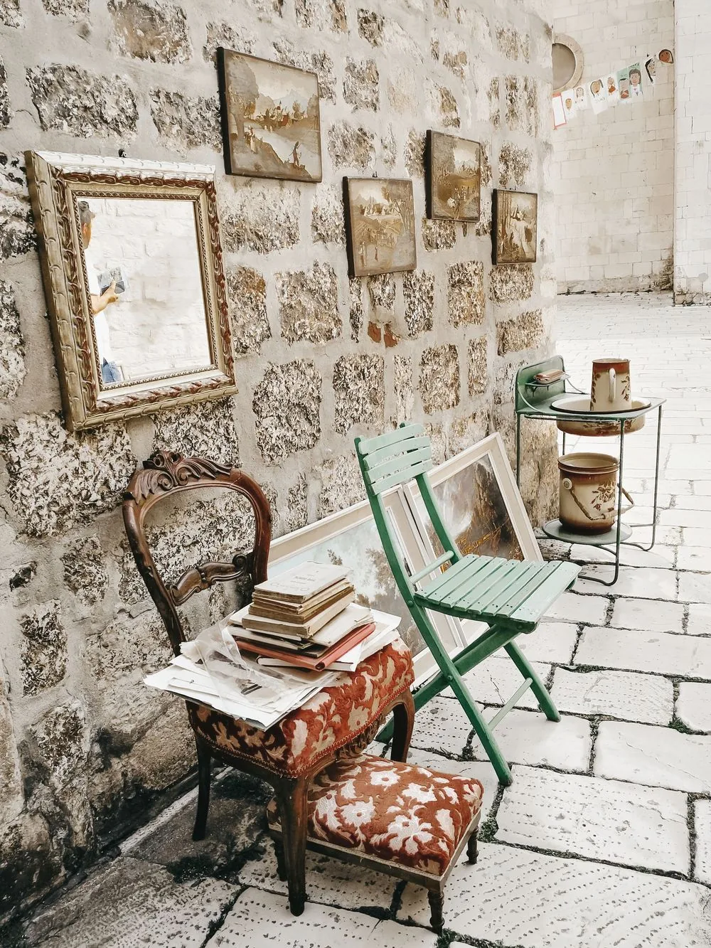
A street corner remembered for its details
Deep, even tones with a detail highlighted here and there.
Intimna strana mediterana · design guide · Photos: private and Pexels.com
10
Every region its own colour
Web
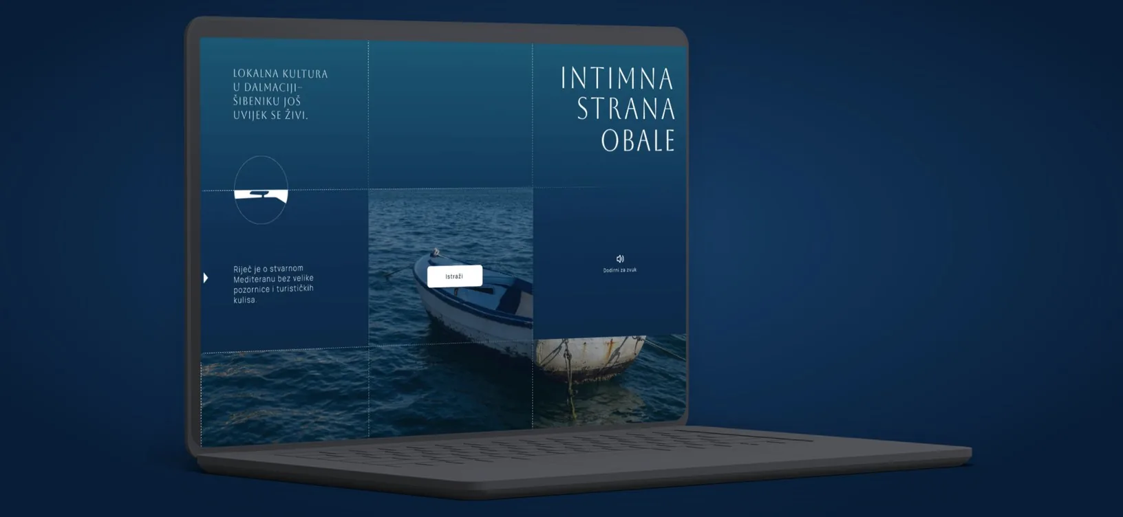
Coast · deep blue
The grid follows the golden ratio, and the sound button is always in the same place.
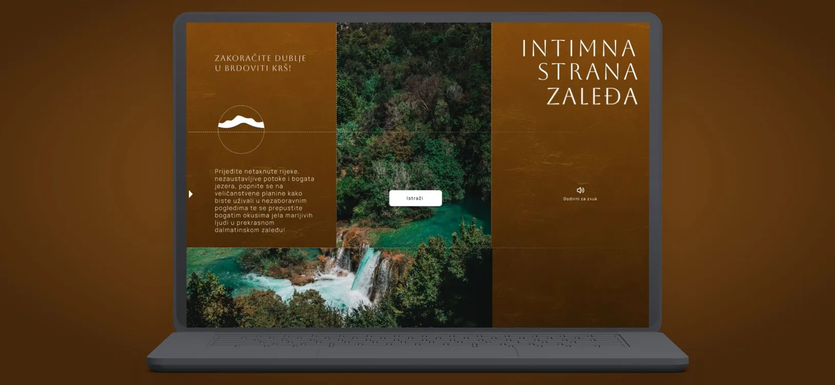
Hinterland · golden brown
Its own colour and texture, the same layout rhythm.
Intimna strana mediterana · design guide
11
One system, different media
Application
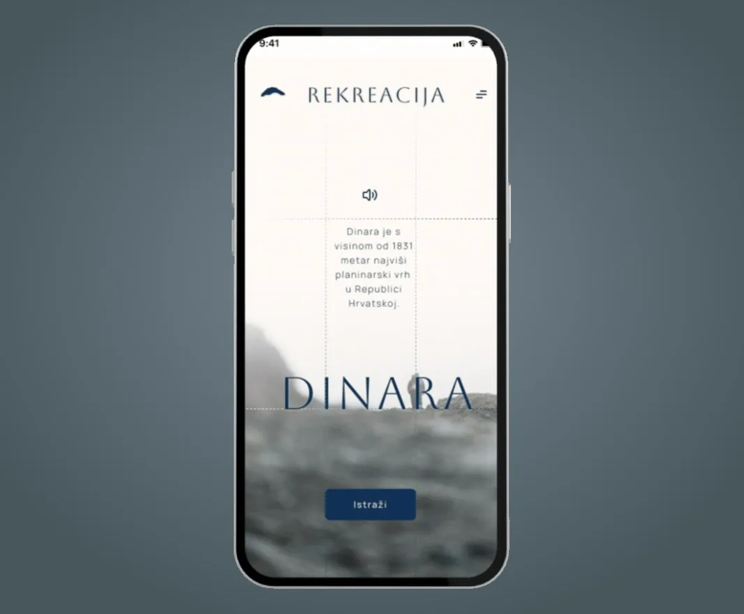
Mobile version
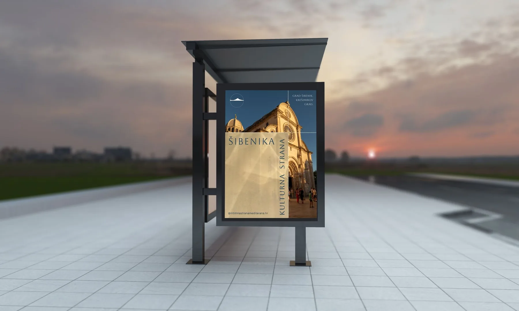
Poster in the city
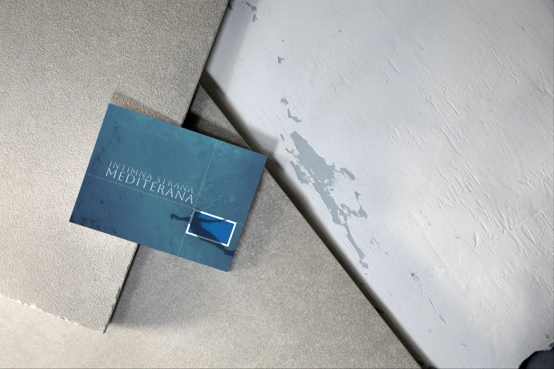
Business card
Intimna strana mediterana · design guide
12
The identity off screen
Space
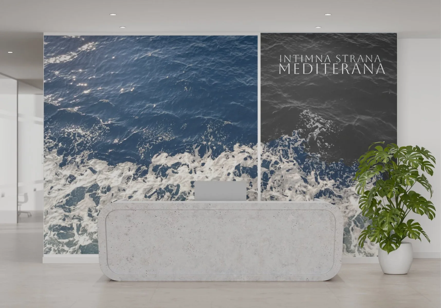
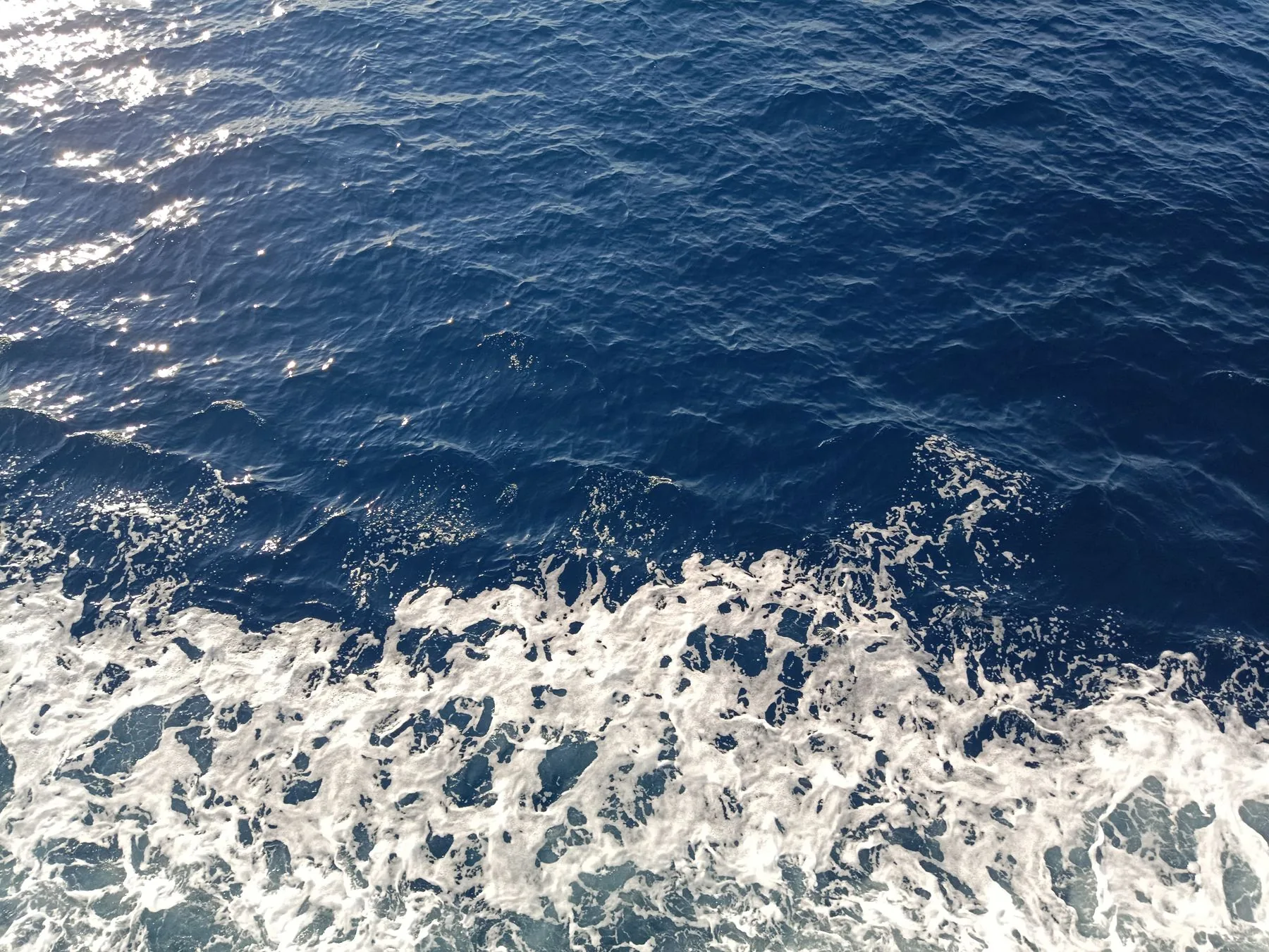
Photos of the sea as wall graphics.
In the reception the same motif appears in colour and in black and white, and the two-line title stays the only text on the wall.
Intimna strana mediterana · design guide
13
Feeling before attraction.
Jana Stoić · Design portfolio
design to use · info@designtouse.com